STAY PLUGGED IN
For the latest in news, shows, upcoming events, new works, contests and special offerings… sign up today for John’s Newsletter.

John's Blog

Sunday, May 27, 2012

Reality Sets In


"Approved" art of the last 100 years proves destructive

When I was in college in the 1960's, having decided to become an artist, there was a distinguishable antagonism and snobbery, from those in the fine art department, toward those of us in the commercial art department. We were considered inferior, having "sold out" our artistic integrity for filthy lucre. In other words, we were artistic prostitutes.


The New York Armory, site of The International Exhibition of Modern Art, the first large exhibition of such works in America


A change in the art world had been building even before the 1913 International Armory Show in New York. Pre-show publicity said, "It will throw a bomb into our art world and a good many leaders will be hit." At the time it was called, "rebellious, quackery, insanity and anarchist". The symbol of the show was an uprooted pine tree, taken from Massachusetts' emblem of the American Revolution.


Henri Matisse  -  Goldfish and Sculpture  -  1911


We were looking at a revolution alright. A bomb had indeed exploded within the art world. By the time I arrived at college, the new, modern art was well entrenched in colleges across the land. If you wanted to be a fine artist, it was their way or no way. Representational art was dead. Fine art had become egocentric. Self expression and originality were preeminent. Art was no longer genuinely useful, nor was it beautiful. Of course, there were exceptions, as in all of life, but the "approved" art of the day abandoned the previous 400 years of art history as "old fashioned". The more enlightened had taken over and those of us who did not buy into it were really not worth their time.


Wassily Kandinsky  -  Improvisation No. 27  -  1912


"The collective spirit of artists toward the expression of their time has given way to the narrow desire to be different, to be unusual, to be original at all costs to the quality of mind. This has produced art for the critic, art for the few, and art for the artist; and in broad has moved away from the main stream of society and its comprehension."  - Millard Sheets


Constantin Brancusi  -  Mademoiselle Pogany  -  1912

Joseph Stella  -  Battle of Lights, Coney Island  -  1913


So where did this "enlightened road" take us? It lead to less education, not more. Actually, less education and training as an artist was better, for there were no longer those awful rules, serious training and hard work that hindered self expression. "Artists" were no longer taught to draw...or even needed to draw. The act of painting became an end in itself and ones explanation of their art was more important than the actual art.


Pierre Giriend  -  Hommage a Gauguin  -  1906


R.H. Ives Gammell writes in his book, Twilight of Painting..."The complete deterioration of our knowledge and our standards of draftsmanship is the most disastrous of all the sequelae of the nineteenth-century impressionist movement. It started from a new approach to a difficult problem presented in all seriousness by well-intentioned painters. They are less to blame for the error of judgment which led them to adopt it than for their inability to abandon the idea as they observed its unfortunate effect in the work of the pupils. The method of teaching devised by these painters failed because the ability to draw cannot be acquired except by the most diligent and concentrated study."
He continues, "The virtual elimination of the serious study of drawing as a prerequisite to the study of painting made possible the present-day popularity of art as a pursuit. Once it was firmly established, the number of art students and of self-styled artists increased with tremendous rapidity. No other profession made as few demands on the intelligence or capacity of the individual as painting in the new acceptation. Few forms of activity offered equal opportunities for self-deception to its practitioners."


I have always taught my students that painting is visual communication and we, the artists, initiators of the communication, have a responsibility to "speak" clearly in a language that our audience understands. Only then can there be conversation. Sound drawing is certainly right there at the heart of having a conversation with our audience.  Anything short of this I term "selfish art"...work done merely to gratify oneself and/or a select minority.


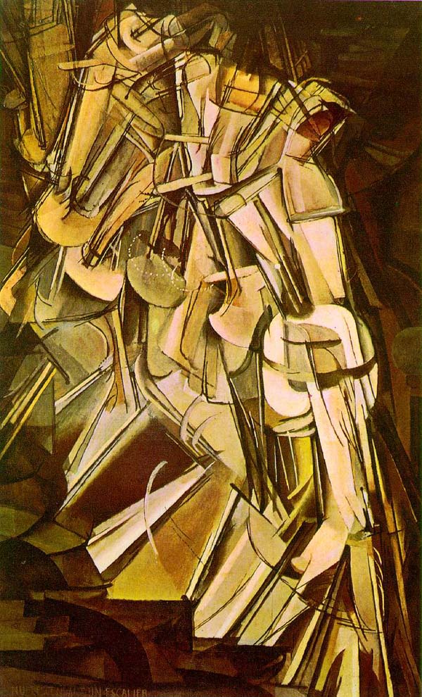
Marcel Duchamp  -  Nude Descending a Staircase  -  1912


"Even in the world of free expression, the artist must feel the need to convey his message legibly to others unless his art remains of such ivory-towered character that he alone understands it. In the main, art must be legible or it falls short of its chief value, if the chief value is to interpret, to make aware, and to create emotional response. The artist must consider the audience regardless of his field of art. Therein lies the greatest failing in contemporary art."  - Millard Sheets


Jean Edonard Vuillard  -  Interior with Hanging Lamp  1899


Cultural deterioration, breakdown of the family, self-centeredness, moral disorientation, rejection of God, greed, desire for fame and stardom have all contributed to an "art" that is at best phony and mediocre, and at worst, blasphemous and insulting. With little concern for their audience, these self absorbed charlatans, with varying degrees of artistic skill, found plenty of adoring writers and museum directors anxious to tell a confused, "stupid" public the merits of this new "art".


Stuart Davis  -  Babe La Tour  -  1913


Well, things are finally changing. In the world of the fine arts, there is a definite move toward high quality representational art. Some of the great representational works hidden for years in museum basements are being brought upstairs. Galleries are finding there's a real demand for finely executed works. 
I've been wondering why this is so in the midst of an increasingly corrupt culture. I think the influence of such powerhouses as the Art Renewal Center and Oil Painters of America has helped but I also think the dramatic increase in the number of professional and amateur artists working today with a bent toward a representational style has also played a part. Additionally young artists and the viewing public have come to recognize the emptiness of "approved" art and are demanding something different...something they can relate to. Art students are wanting sound training. Many are rejecting the "approved" art of the college laboratories and are seeking their training through ateliers and well grounded art schools. Artists want to increase their vocabulary so that they can speak for themselves with a clear voice, as artists of old, unaided by an interpreter. The audience is more than ready to listen. Now that is a good thing. 


If you would like to receive my monthly newsletter, please click HERE


Labels:

Sunday, May 20, 2012

Greenhouse Gallery 'Spring Festival'


Greenhouse Gallery of Fine Art
6496 N. New Braunfels Avenue
San Antonio, TX 78209
800-453-8991
Spring Festival 2012  -  18 May - 8 June

I am pleased to be represented by Greenhouse Gallery and to be a participant in this outstanding show.

Below are a few selected works.
Go HERE to see the whole show.

Kathryn Stats  -  Country Road  -  10"x 17"  -  Oil

Bryan Mark Taylor  -  Field and Farm  -  16"x 20"  -  Oil

Eustaquio Segrelles  -  La Nina de la Cesta  -  31.8"x 45.6"  -  Oil

Mary Qian  -  Becca  -  22"x 18"  -  Oil

John Pototschnik  -  Rural Winter  -  14"x 14"  -  Oil

Javier Mulio  -  Destiny  -  13.7"x 10.6"  -  Oil

Natasha Milashevich  -  At the Window  -  35.5"x 27.5"  -  Oil

Dianne Massey Dunbar  -  From the Outside Looking In  -  20"x 20"  -  Oil

Daniel Keyes  -  Dolls, Books, & Crayons  -  20"x 16"  -  Oil

Brent Jensen  -  Ranch Winter  -  8"x 16"  -  Oil

West Fraser  -  If I Had Ever Been Here Before  -  16"x 20"  -  Oil

Josh Clare  -  Power-ful  -  24"x 24"  -  Oil

Giner Bueno  -  Mercado de Hortalizas  -  38.2"x 51.1"  -  Oil

Kathy Anderson  -  Rose of Sharon  -  12"x 10"  -  Oil

Alvar  -  Tiempos Persistentes  -  20"x 24"  -  Oil


If you would like to receive my monthly newsletter, please click HERE

Labels:

Sunday, May 13, 2012

Denise LaRue Mahlke Interview


I first met Denise several years ago in Arkansas where I was teaching a workshop. She didn't need to be there, but it's a testament to her desire to always learn and grow as an artist that put her in the class. She was good then, but in recent years she's really found her creative voice and is doing some really nice work. When she won 1st Place in the Landscape category of the 2009 Art Renewal Center International Salon...well, that to me was a turning point. More and more her work in both pastel and oils is gaining a national reputation. She is quiet, thoughtful, and considerate.


Rhapsody  -  24"x 36"  -  Pastel
(1st Place, Landscape  -  Art Renewal Center Salon 2009/10)


Denise has achieved her high level of competence through hard work and attentiveness to the instruction and guidance of other artists, gleaned through workshops she has taken over the year. Bob Rohm was a big influence during her early years of study, while T. Allen Lawson continues to mentor her to this day.


I've asked her to speak about her work. I think you will really appreciate her comments and learn a great deal from her response to my questions.


What is your definition of art?  An expression of beauty and truth communicated through the skillful and thoughtful mastery of the artist's chosen medium.
How would you define your role as an artist?  Art is a gift from God and as an artist, it is my responsibility to glorify and honor God with the work of my hands and to continue to learn and grow as an artist that my work might be a reflection of Him. My work should communicate something of His beauty to the viewer. 


Lavender Twilight  -  6"x 6"  -  Pastel
(1st Place  -  '6"Squared"  -  Randy Higbee Gallery Show)


How does your work reflect your personality?  People say my work evokes a sense of peacefulness and quiet or contemplation. I tend to be drawn by more intimate, quiet scenes and I guess that is a part of who I am.
How does one find their individuality as an artist?  By continually seeking, asking, and knocking in pursuit of excellency in our work. It takes time, perseverance, and practice to develop your skills to the highest level possible. It also takes love, I think, and a heart of thanksgiving.
Do you consider the process of painting more important than the result?  In the process is thanksgiving, praise, and joy - mixed with sweat and tears at times, but the result is the giving of the gift to connect and communicate with others.
How much of your work is intellectual vs. emotional...and how would you define the difference?  The emotional response to a scene is what makes me stop and take notice and inspires me...the intellectual is how I go about best defining and presenting it through thoughtful manipulation, editing and designing of the scene to somehow express it.


The Test of Time  -  12"x 16"  -  Pastel


What part does plein air painting play in your work?  I love painting outdoors. I go to seek answers to questions, to gather material, and to just observe first-hand, color, light, texture, and value. It is useful to then take my plein air study into the studio to develop a larger studio piece using my color notes, along with sketches, writing, and photos. Sometimes I will do a finished piece outdoors but most times it ends up as a reference.


Summer Idyll  -  9"x 12"  -  Pastel
(
5th Place, Landscape  -  '13th Annual Competition'  -  Pastel Journal)


What is the major thing you look for when selecting a subject?  The thing that makes my heart skip a beat. The heart response, triggered by the light, or color, or mood is what I try to hold on to as I continue to ask myself, what was it that made me stop? Why? and how can I best express it?


The Gilded Edge  -  11"x 14" -  Pastel


Do you let the subject determine the concept of the work or do you create the concept and use the subject only as the starting point?  I guess I work both ways. Many things can spark an idea, the written word, beautiful and masterful art, God's creation. I like to travel and paint letting the subject move me, or I will go seeking the landscape I need for a concept I have.
What part does photography play in your work?  I do take photos wherever I go, and while painting plein air. I use photos in my work as an aide, especially when the subject is a moving target like clouds, fleeting light effects, or young children, but mostly as a jumping off point or to jog my memory of place.
You work primarily in pastel...and some in oil, are there any significant differences between the two?  Actually they are similar in that with pastels, I work dark to light, hard to soft, keeping darks more transparent and lights more opaque. In oils you work dark to light, thin to thick, keeping darks more transparent and light more opaque. When I started painting in oils again after several years of working in pastels, I would often ask myself how I would handle a subject or solve a problem with pastels then I would apply that to my oil painting. It worked!
With pastels, you can layer and optically 'mix' color on the painting surface, but you cannot really mix a color like you can with oil paint. That is why you often hear from a pastel painter that you can never have enough pastels.
In both mediums, it is very easy to mix 'mud' if you are not careful...and if you start out with too soft a pastel you can fill the 'tooth' of the paper too soon, making subsequent layers more difficult. 


Spring Reflection  -  8"x 8"  -  Pastel


Do you consider pastel a drawing or painting medium? Why?  Both! I have heard the explanation that a sketch or drawing uses the tips of the pastel, or pastel pencils, letting most of the paper show through and that a painting uses more of the sides of the pastels, covering most of the paper with pastel. I consider what I do, painting.
What's your preferred surface when working in pastel?  I use a sanded pastel paper (Uart, Wallis, etc.) mounted on gatorboard to have a more rigid surface. I also experiment with making my own surface, gessoing gatorboard to seal it, then applying several layers of pumice mixture, sanding between each layer.
Talk about your selection of colors when working in pastel and oil.  My pastel box is divided into warms, cools, and neutrals separated into three main values, plus accent darks and lighter lights. It is a mix of medium to very soft pastels and a separate smaller box with hard pastels.
When I paint with oil outdoors, I usually limit my palette to Ultramarine blue deep, Cobalt blue pale, permanent Alizarin, cadmium red light, cadmium lemon yellow, cadmium yellow medium, and titanium/zinc white. I will at times use transparent red oxide or burnt sienna, and viridian on my palette. I do like to try different colors from time to time, depending on where and what I am painting.
What is your major consideration when composing a painting?  I think about placement of a center of interest and leading the eye through the painting, as well as areas of quiet to counterbalance an area of movement or emphasis.


Autumn Veil  -  12"x 12"  -  Pastel


How thorough is your initial drawing?  I love to draw. Most of my drawing before I paint indoors or out, is small thumbnail sketches to work out design and values. I like to do a more thorough drawing when the scene or subject is more complex. I love charcoal and pencil drawing and try to make the weekly life drawing session, drawing figure or portrait. A goal of mine this year is to do more large drawings outdoors, especially of trees and old buildings.
How do you decide on a dominating color key for a painting, and how do you maintain it?  I think about this in the planning/design stages of a painting. I will play with different color schemes and the use of complementary colors as well as the dominant value of the painting before I begin painting. Sometimes I will do small color studies in the studio with pastel, watercolor, or oil. I use my Analogous color wheel which is based on the Munsell system after I determine my dominant color, for different color combinations. It helps too, to go back to those notes as I paint. Like my thumbnail sketches (used for design and value), these are my road maps if I get off track. Another way to help maintain the harmonious color scheme, is to block in the under painting in the same analogous color family, using warm and cool versions of red, for instance, under a predominantly green painting.
Keying the sky is very important since it is the main light source. At times I will choose not to block in the sky but let the paper add luminosity to the sky. This works especially well with white Wallis pastel paper. Uart is a buff color so it also works well with the predominant blues of skies and clouds. Other times I will put down an initial color, paying close attention to value, especially for evening or morning twilight to set a mood for the painting.
Describe your typical block-in technique.  After deciding on my design, using my small sketch as reference, I will lightly indicate major shapes on my pastel paper or canvas with a hard pastel, soft lead pencil, or with thinned paint when working in oils. After that I approach my pastel several different ways, depending on the overall key or mood of the painting. Most often I will use hard to medium soft pastels to block in the shapes, sticking with mid-dark to dark values relative to each shape. I will usually pick at least two pastels, a warm and a cool of the same value for each shape. After covering the paper lightly with the pastel (sometimes I will leave the sky alone, letting the paper show), I will then use odorless mineral spirits (Gamsol) and an old brush to scrub and 'paint in' these areas of pastel. This stains and tones the paper. Once dry, I start the painting process by reestablishing some darks then working mid-dark to light, saving the lightest lights for last. Outdoors I will sometimes start from the center of interest   outward, knowing if my values are right in the under painting, I can pretty much leave the secondary areas of the painting alone and have enough information to use the painting as reference back in my studio.


Welcome Spring  -  11"x 13"  -  Pastel
(2nd Place, Animal  -  '10th Annual Competition'  -  Pastel Journal)


What advice do you have for a young artist/painter?  Very few good artists get to where they are without working hard and taking risks, always trying to grow. Ultimately, your job is to focus on the quality of your work, continually moving from 'painter' to 'artist'. The awards, shows, galleries, will come in time. Keep after your goals daily. Pursue excellency in your work and work to give. I think this quote from Andrew Wyeth pretty much says it all: "I think one's art goes about as far and as deep as one's love goes, I see no other reason for painting but that."
Any advice for a first-time collector?  Educate yourself. Talk to artists, gallery owners, and other collectors, then buy what you love.
If you could spend the day with three artist, past and/or present, whom would they be?  Andrew Wyeth; Russian master, Isaac Levitan; Mary Cassatt and Edgar Degas (together).


Twilight on Spring Creek  -  18"x 24"  -  Pastel
(Honorable Mention, Landscape  -  Art Renewal Center Salon 2009/10)


Thanks Denise for a great interview. Here's her website to see more of her work.


Upcoming interviews will feature Marc Hanson, Michael Godfrey, and others to be named later.


If you would like to receive my monthly newsletter, please click HERE


Labels:

Sunday, May 6, 2012

San Gimignano


28 May 2007: Italy


At 1:30 PM we left for the small, medieval hilltop town of San Gimignano. The walled town is located between Siena and Florence, in the province of Siena in Tuscany, and is known for its many towers. There were originally 72 towers, built by wealthy families to show off their wealth and influence in the area. The larger the tower, the greater one's status. Today there are only 14 towers left with only three being fully intact. The town achieved its greatest influence between 1100-1300 AD.


San Gimignano Overlook  -  16"x 12"  -  Oil
(This painting is available through Greenhouse Gallery)


The only remaining towers of San Gimignano


What I found most exciting was the hilltop view. The scenery was just incredible. Maybe it was actually a blessing that it rained today because with the high winds, the sky was continually and rapidly changing from sun to rain and back again, creating some really dramatic panoramic shots.
Beautiful countryside as viewed from San Gimignano


I'm hoping I captured many valuable and useful pictures today. On the way to San Gimignano we stopped at an American cemetary that contained the bodies of some 5000 soldiers that had died in Italy while fighting to free Italy from tyranny. 
Cemetary honoring American soldiers who died in Italy during WWII


After our stop in San Gimignano we continued on to the Castle Oliveto in Siena province, the Chianti region, where Chianti wine is made. The drive through the Tuscan countryside was spectacular. In the castle, where several popes, kings and generals from bygone days have stayed, we had a multi-course dinner which began with a wine tasting of 6-7 wines served with toast and a variety of spreads...olive, mushroom, tomato, and sausage. The meal consisted of all the wine we wanted, a ravioli dish, veal, turkey, a variety of vegetables, fried potatoes, bread, and a fruit bowl with ice cream. 


Castello di Oliveto


It was a full day but a nice one. Everyone was in a very good mood while driving back to our hotel in Montecatini as Dean Martin's, Come Back to Sorrento, filled the tour bus with beautiful music.


(Excerpt from a daily journal kept during a trip my wife and I took to Italy in 2007)


Dean Martin sings Come Back to Sorrento


If you'd like to receive my monthly newsletter, click HERE


Labels: